April 19, 2016 / in How To, LinkedIn / by Mic Johnson
Post author: Mic Johnson
Full disclosure. I’m a big fan of LinkedIn. I’ve been using it for the better part of the last 10 years…first as a recruiter and now as someone who trains others how to best leverage LinkedIn personally and professionally.
But I’ve never been a fan of the way LinkedIn makes it hard for people to see and do things that should be more prominent on the site. I hear the same feedback from people all of the time who say that LinkedIn isn’t user-friendly. That isn’t what you’d expect from a social network that’s been around for almost 14 years.
LinkedIn has all kinds of hidden features that shouldn't be hidden. Share on X
With that in mind, I’m going to lift the veil on a few of those hidden features until LinkedIn makes them easier for everyone to find.
(NOTE: The features I’m highlighting are best viewed from a web browser (which is honestly where I still use LinkedIn the most) instead of their still-much-to-be-left-desired mobile app.)
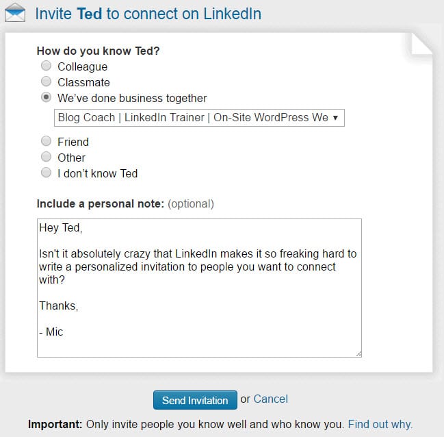 1. Personalizing LinkedIn Invitations
This has been my #1 pet peeve with LinkedIn FOR YEARS. I have no idea why they won’t make it easier to personalize invitations. The way they have it set up currently DISCOURAGES engagement between LinkedIn users. Here’s the deal…
![]() If you click the blue CONNECT button just about anywhere on LinkedIn, it will automatically send the “I’d like to add you to my professional network on LinkedIn” message.
If you click the blue CONNECT button just about anywhere on LinkedIn, it will automatically send the “I’d like to add you to my professional network on LinkedIn” message.
UNLESS you’re on someone’s profile (on a web browser), and click the button there, then you’ll see the option to personalize your invitation as shown in the image here. (Or, if you’re on mobile and you’re on someone’s profile, you can click the three little dots in the upper right hand corner for an option to personalize your invitation.)
What really bothers me is NONE of this isn’t intuitive.
Most people will see a big blue CONNECT button and just click it….which is why all of us get countless impersonal “I’d like to add you to my professional network on LinkedIn” messages from people we don’t know and wonder why they want to connect. #LinkedInFail
Which takes me to my next point….
 2. How to Reply to Invitation Requests From People and See If They Wrote You a Personalized Message
When you hover over the icon showing you have pending invitations and then click on the words “Pending invitations” you get a page with the photo of the people who have sent you invites. But you don’t see a message from them, do you? NOPE. Why?
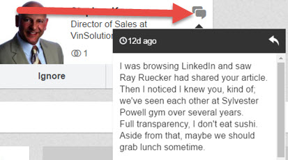 Because in order to see if they wrote a personalized message, you have to click the little “quotes” and then an expanded window pops open.
What makes this even worse is if someone wrote you a personalized message that you never saw because you just clicked “ACCEPT” or “IGNORE” instead of hitting the little quotes.
I can’t imagine the number of times personalized messages are being completely missed because of this LinkedIn “hidden feature.”
It discourages engagement and it’s not intuitive. #LinkedInFail
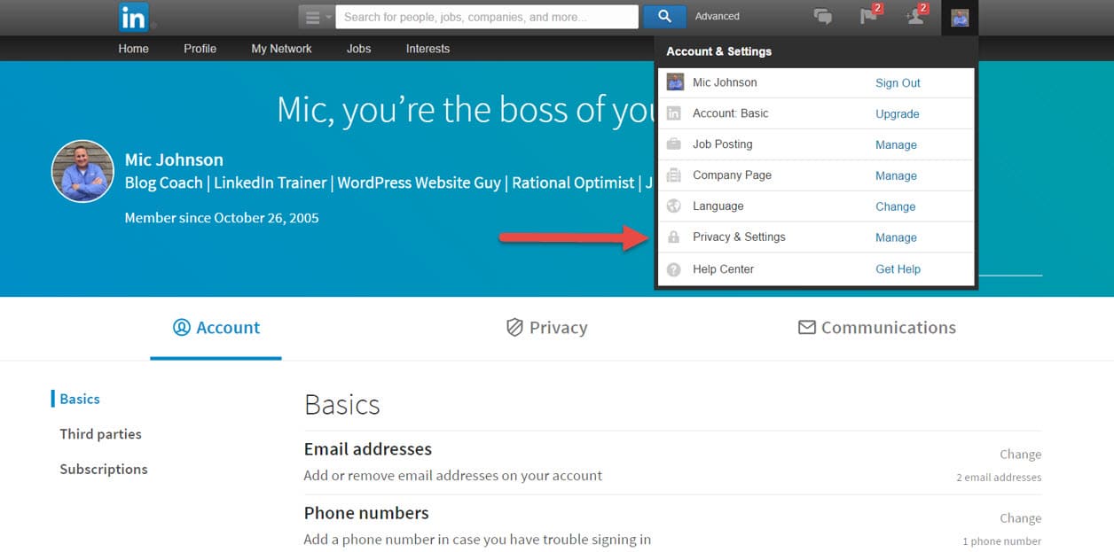 Did you even know this was possible? If you’re like most people, the answer is probably NO. Why?
Because it’s hidden underneath your small profile picture in the upper right hand corner and you have to click that image to see the privacy and other options.
Again, sensing a theme here? Not intuitive. #LinkedInFail
 I just found this setting the other day. If you go into your Privacy & Settings and click on ACCOUNT, you’ll see “Where you’re signed in.”
When I did it, I had TEN active LinkedIn sessions going…and one was from 3 months ago!
You can easily sign out of unwanted active sessions here, so that’s awesome. But again, LinkedIn makes you hunt to find this hidden feature, and that’s why it earns the #LinkedInFail.
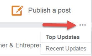 5. Top Updates vs. Recent Updates
This is one of my bigger pet peeves with LinkedIn. Like any effective LinkedIn user, I spend time engaging with my connections by viewing/liking/commenting on their updates that appear in my “HOME” feed.
Little did I know that LinkedIn has the default view set to “Top Updates” instead of “Recent Updates.”
If you click HOME and then look right under “Publish a Post”, you will see three little dots like you see in this image here. Then select Recent Updates. I found there were several updates from my network that I wasn’t seeing because of the default “Top Updates” setup.
Also, and even more annoying, if you click away from the home page to another part of LinkedIn and then come back…yep, you guessed it, it defaults back to Top Updates.
I’m not a fan of social networks (Facebook does this too) choosing what they think I want to see instead of the other way around. #LinkedInFail
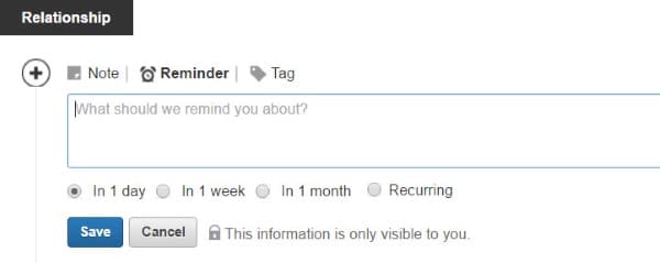 6. Relationship Tab
When you’re on the profile page of one of your connections, tucked right underneath their photo is the Relationship tab. Most people, myself included, haven’t paid much attention to this section.
From here, you can jot down notes about the person, set follow up reminders and tag (put the person in a category such as “Prospects”) them so they can be included, and sorted, among your contacts.
This could be a great feature and used more often, but the way it’s laid out in LinkedIn makes it missed more often than not. #LinkedInFail
In summary, LinkedIn is one of the best tools out there for connecting with people in business, finding people you share in common with others, and consuming and sharing quality content.
But LinkedIn needs to spend more time making the user experience more intuitive and and stop forcing people to click around to find hidden features. Until that day comes,I guess I’ll keep writing about them.
What other LinkedIn hidden features have you found? What recommendations do you have to help them improve the end user experience? Share your Comments below for us and our readers…and, as always, thank you for your support of Blue Gurus!
Comments are closed.
What a great “reveal” Mic. I too love LinkedIn and had missed many of these features you mention here. Thank you for discovering them and sharing them!
Thank you so much, Brenda! I’m glad you enjoyed the article and learned something new! -Mic
Are these features more obvious in a paid membership?
I highly doubt it. That wouldn’t make a lot of sense because these aren’t critical features as much as they ate common sense features.
Thanks for taking the time to read the post!